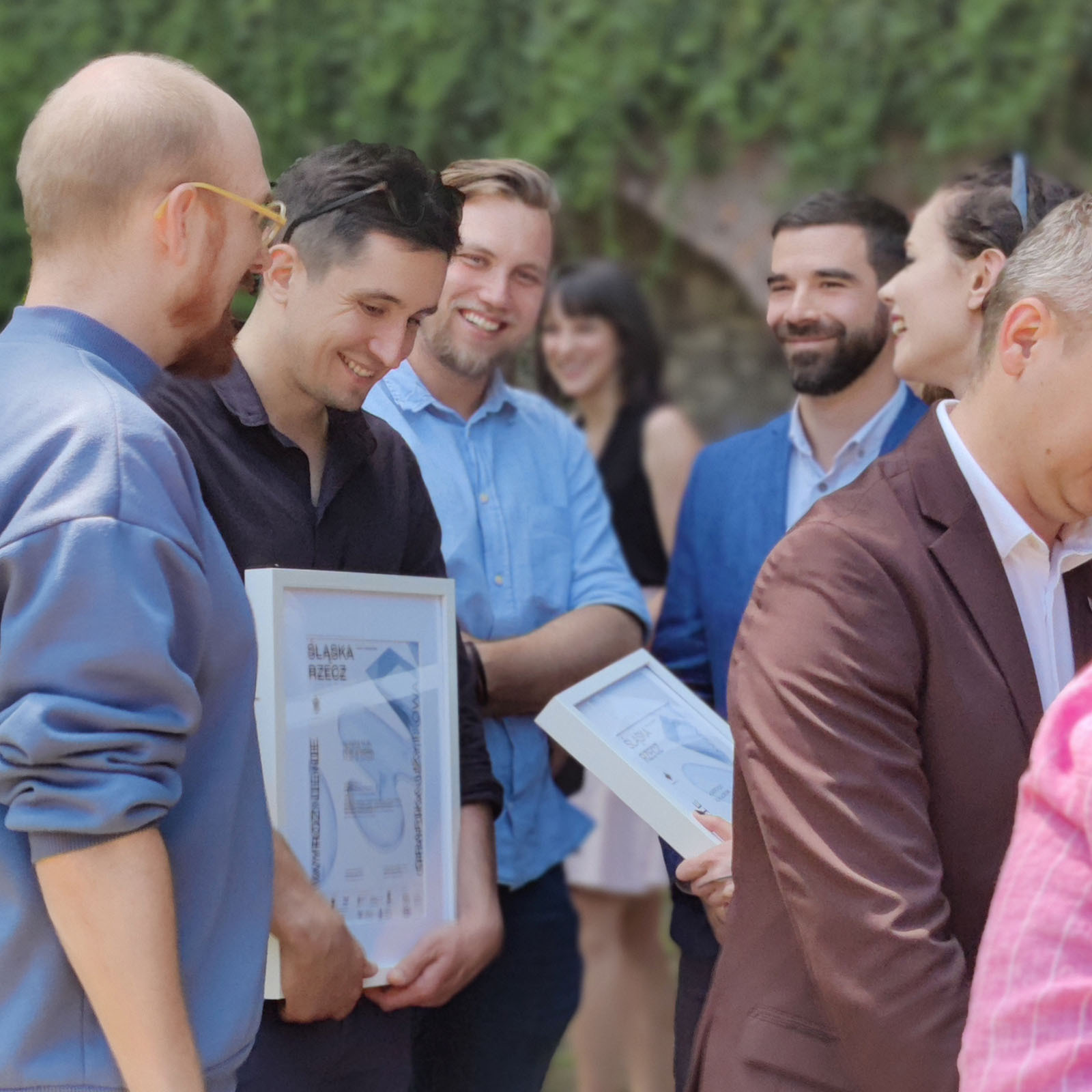
We have Nomination in Project of the Year 23/24!

We invite you to read the post in which we were the first to initiate a new Grafmag series "52 weeks of Polish design", a series devoted to the most interesting Polish projects.
Read full article↗︎
Grafmag wrote about our project for Morfos!

Grafmag, an industry magazine about graphic design, published our latest project for Morfos Design.
Read full article↗︎
See you at GrafConf 2024

We’re heading to Toruń in September for GrafConf, where as part of the STGU portfolio consultations, we’ll be discussing all aspects of brand and product design with you.
We are featured in the main category on Behance!

Our latest project for Morfos Design received a blue badge and has been featured in the main category of top projects.
Morfos Design Branding

The new identity for Morfos is the result of strategic and design work that reflects the brand's philosophy based on a balance between technology and nature, leading to mutual harmony. The full case study of the project is available here↗︎.
An intern on board ;)

This year, as part of an internship, we hosted Marta, a second-year student at the Academy of Fine Arts in Katowice, who completed a visual identity project related to local culture and folklore.
We've got a DNA Awards!

Our design of a corporate identity system for AUF Studio won an award at the DNA PARIS DESIGN AWARDS.
New visual identity for the engineering office IZ/BUD

The visual identity for the engineering office IZ/BUD is a debut for us in the construction industry. The full case study of the project is available here↗︎.
We’re in the finals of NAPA BALTIC competition!

We are finalists in the NAPA competition. We have been nominated for our packaging design for the Refeet cosmetics brand.
The full case study for the Refeet brand project is available here↗︎.
Nvidia - A Day in the Life of the Studio

We're excited that we've just been featured in a new video on the @nvidiageforcepl YouTube↗︎ channel.
It gives you a sneak peek into our daily life at the branding studio, sharing our inspirations, how we work with clients, the different projects we tackle, and all the nitty-gritty details. Plus, it's all powered by NVIDIA Studio. You might find it really interesting!
Meet Kasia. The new member of our Studio!

The Studio is growing! We are very pleased to welcome Kasia Olejarczyk to our design team. Kasia is a versatile designer, a graduate of the Academy of Fine Arts in graphic design.
She specializes in motion design, 3D, and designing visual identities. In her spare moments, she indulges in constructing Lego masterpieces, nurturing her plants, pampering her cat, and harboring a fondness for tattoos.
STGU mentoring summary

The Studio is growing! We are very pleased to welcome Kasia Olejarczyk to our design team. Kasia is a versatile designer, a graduate of the Academy of Fine Arts in graphic design.
She specializes in motion design, 3D, and designing visual identities. In her spare moments, she indulges in constructing Lego masterpieces, nurturing her plants, pampering her cat, and harboring a fondness for tattoos.
Project of the Year 22/23 Nomination

We have a nomination for the Project of the Year for the branding of the architectural studio AUF↗︎. The nomination is in the Idea category.
Project of the Year is the first graphic design competition in Poland that goes beyond aesthetic evaluation, engaging in the reflection of design's function and the social responsibility of its creators. Project of the Year is organized by STGU.
The design process behind the scenes

Are you curious about what creating a brand looks like from the other side? As part of our series, we present a few snippets from the design process of the AUF Studio brand.
The project for the architectural studio AUF is one of our favorites. Mainly due to the very interesting and successful process that accompanied the creation of this project.The full case study can be seen here↗︎.
GrafConf 2023

This year, as part of the GrafConf conference in Toruń, I will have the pleasure of conducting workshops on building a brand's visual language. In addition to that, I will also be consulting your portfolios as part of the STGU consultations.
Process of creating ideas

We present a new series in which we will share with you our workshop, sketches, doodles and various things that appear at the design stage. We will share with you what you often do not see.
STGU mentoring program

I am a mentor in the second edition of the mentoring program organized by @stgupl. The group of mentors is really great, I am very pleased to be part of such a group.
New project!

Rebranding for Inventity Foundation↗︎.
Carrying out comprehensive rebranding requires customer trust. In this case, the rebranding was a real revolution. Throughout the process, when the effects were not fully visible and the scale of work was difficult to grasp, trust became even more important.
The cycle of 52 weeks of Polish design

We invite you to read the post in which we were the first to initiate a new Grafmag series "52 weeks of Polish design", a series devoted to the most interesting Polish projects.
Read full article↗︎
AUF Studio Branding

We present the new visual identity for the architectural firm AUF Studio↗︎. AUF Studio is an architectural studio with over 30 years of experience.
The brand name AUF consists of three letters, which are an abbreviation for Architecture, Urbanism and Form. The name itself, in its form and sound, is strong and recognizable. That's why we decided that the AUF symbol would be an integral and flexible part of a larger system, and its simple form would be the best carrier for the brand identity
New cosmetics brand

We created a name, strategy, identification and packaging line for the Refeet↗︎ brand.
Refeet is a cosmetics brand that devotes its entire portfolio to professional foot care.
Interview for Nvidia

I had the pleasure of being a guest of Michał Kempa in "Z prędkością wyobraźni" podcast by Nvidia and MSI.
See interview↗︎
Honorable mention in the Śląska Rzecz competition

Last week, we had the great pleasure of receiving a jury distinction in the category of applied graphics in the @slaskarzecz competition for the branding of @heartspub!


