AUF Studio
Minimal Forms Unlock Infinite Possibilities
The brand name AUF consists of three letters, which are an abbreviation for Architecture, Urbanism and Form. The name itself, in its form and sound, is strong and recognizable. That's why we decided that the AUF symbol would be an integral and flexible part of a larger system, and its simple form would be the best carrier for the brand identity.
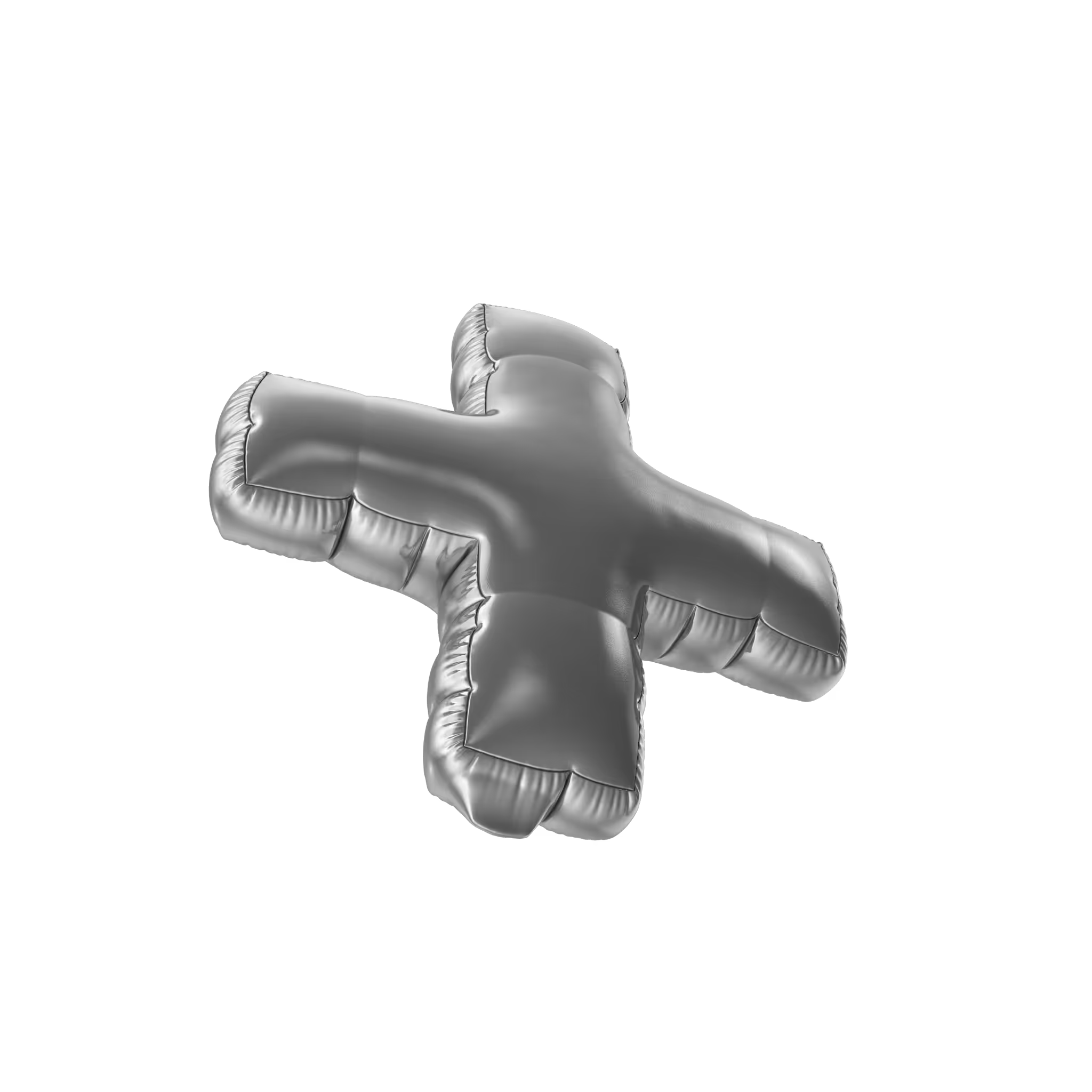
The AUF symbol consists of the letters "A", "U" and "F" incorporated into basic forms such as a square and a circle. Relationships between these individual elements refer to space, order, and project context. The simple form of the symbol allows for a wide range of transformations without loss of integrity.


The visual language consists of reduced and simple elements, from typography, to a reduced color palette, minimalist icons, and finally a simple symbol. As an Architect Branding Specialist, we provides uniqueness here in the dynamics and changeability of the arrangement and relationships of these elements in the system. The symbol "floats" across the grid in various compositions. Based on strict system assumptions and precise layout grid, we build increasingly engaging and surprising variations of compositions.
Thanks to simple forms, we also have the possibility of a smooth transition from 2D to 3D, thereby communicating the key moment in design when the project becomes a reality. Spatial thinking, form play and the vision characteristic of the brand owners become clear.
Last but not least, the visual language (color, typography and form) is also a strong reference and tribute to modernism and the Bauhaus ideas, which laid the foundations for contemporary architecture.


What our Clients feel of
Michal takes initiative to bring structure in the activities and combines his structured approach with a lot of creativity.
Michal listens well to the wishes and expectations, and is very skilled in translating this into visuals and templates that strike the right tone and sentiment. I’ve learned to know Michal as a person who keeps his promised schedules and delivers his work with high quality.


